Jan 06, 2022
Posted By Sheetal
Color has the power to
completely change your home. Just like our choices in clothing, furniture, and
books, colour expresses and effects who we are. It has a tremendous impact on
how you feel in your home and the way it presents itself to visitors.
Tile, carpet, and
furniture come in less variety of colours than paint so it’s generally
advisable that you select these first. One key to all colour schemes is a
balance, so if you choose some vibrant fabrics for your upholstery it’s likely
you will want to tone down your selection of paint for the room they occupy.
Pattern and colour tiles add a great deal of visual excitement to a room and
should be similarly balanced with more sombre or serene colour palettes.
On the
other hand, plainer tiles and stone often act as a base material that can be
used with either restrained or vibrant colour schemes.
A strong and bold
colour, red is not frequently used outside of the kitchen or dinning room
accept in more muted and darker shades. Red brings warmth and energy to space,
encouraging action and giving off connotations of power. Especially when seen
in natural materials like brick or ceramic, red can have also had a cheery
effect on a room and work well with other colors.
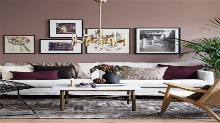
Neutral colours like
grey, white, and brown can act as a foundation for more vibrant schemes or set
the stage for an all-neutral color palette. Neutrals give a soberer and
restrained feeling to space, which makes them excellent for rooms with a more
serious purpose. At the same time, neutrals provide calm and clarity that makes
them well-suited to bedrooms where people decompress and relax..